↧
Beatles Bootleg Recordings 1963 on sale
↧
Hope For The Future - Promo CD
 |
| Paul McCartney's new release is also out as a promotional CD. |
1. Hope For The Future (Edit) 3:08
2. Hope For The Future (Main) 4:06
3. Hope For The Future (Trash) 2:56
4. Hope For The Future (Beatsession Mix) 6:00
5. Hope For The Future (Jaded Mix) 5:33
6. Hope For The Future (Mirwais Mix) 4:24
The EP will also be made available on a 12" vinyl disc on January 12th (Jan. 13th in the USA), but if you don't own a turntable and you prefer physical, factory made discs to downloads, the promotional CD is what you'll need to hunt down.
In an interview with Digital Spy, McCartney was asked if he thought more and more acts will turn to video games as an option to get their music out there?
"I think it's a possibility, yeah. It really depends on whether the people making the games think it's appropriate. I mean Prodigy did that thing years ago, 'Firestarter', and that was for a video game. It was for a very early Playstation thing, and I remember thinking, 'Wow, that's cool,' because that's how I would hear that song. People have done it since, so I'm not the first to do it. But what I've done is a straight forward song rather than a digital one, which you can do for computer games. With this game being big and epic, it was more like writing a film soundtrack. I wonder that it well might happen that people start to ring up the video game developers... 'Hey, I've got a song!'"
Of course, McCartney is known to have been fascinated by video games early on. Back in the 8-bit era, a video game was created around his "Give My Regards To Broad Street" film in 1984, and his 1989 music video for Ou est le Soleil was inspired by the video games of the day.
↧
↧
Ringo to be inducted into Rock and Roll Hall of Fame
 |
| Ringo got a phone call from Paul, who told him he was about to be inducted into the Rock and Roll Hall of Fame |
Rolling Stone has an interview with Ringo about this, where he also says that his new album is finished and talks a bit about the upcoming tour.
The induction ceremony will be held on April 18th, 2015 in Cleveland, Ohio, and the drummer will be inducted by his bassman, Paul McCartney, who said he was looking for something to do that night.
Source: Rolling Stone
Ringo's page at the Rock and Roll Hall of Fame website
↧
Album covers: Please Please Me
PLEASE PLEASE ME
 |
| Please Please Me - Angus McBean |
When the matter came up of the album cover for the first album of the Beatles, their producer George Martin proposed to call the album Off The Beatle Track. A picture could be taken at the nearby London Zoo, he reckoned, in front of the home of the insects. Paul doodled a few sketches for a design with that title. George Martin advised the use of the theatrical photographer Angus McBean, a man he worked with in the past.
 |
| Please Please Me - Paul McCartney's illustration. Even though it was John Lennon that had attended Art school, it was usually Paul McCartney who took an interest in the design for the Beatles record covers. |
 |
| George Martin's album |
 |
| UK EP-cover |
 |
| USA - Introducing The Beatles album |
I only had my ordinary portrait lens, so to get the picture, I had to lie flat on my back in the entrance. I took some shots and I said, "That’ll do."
 |
| Please Please Me - Photo session |
A number of pictures were taken with the four boys looking down over the railing of the first floor to the entrance of the building.
But not everybody was convinced. On March 5th, EMI staff photographer John Dove took publicity pictures of the Beatles in and round the EMI-house. On some of these also Dick James, George Martin and Brian Epstein can be spotted. Afterward he tried to make a suitable picture for the album-cover, with the Beatles fooling around with a parking meter at the nearby Montague Place and jumping of the steps of the EMI studio in Abbey Road.
 |
| Unused idea for the first Beatles album |
 |
| Fooling around with a parking meter at Montague Place |
The cover made the staircase so famous that when, at the end of the ‘90s EMI vacated the premises at Manchester Square and moved to alternative office accommodation, the staircase was dissembled and painstakingly rebuild on the new premises.
Besides for the cover of the first album, different variations of the session are used for these covers:
- the EP The Beatles (N°1)
- the two compilations The Beatles 1962-1966 and The Beatles 1967-1970
 |
| UK Beatles EP |
 |
| Red album (1962-1966) |
The sleeve notes on the back of the album sleeve are written by Tony Barrow.
The cover of the first pressings was a laminated sleeve with a polythene lined inner sleeve on which an advert for "Emitex" cleaning cloths was printed.
 |
| As proud as can be, the boys are showing off their fresh first album. |
This article was written by Patrick Roefflaer and you can find it in it's older incarnation here.
↧
Album covers: With The Beatles
WITH THE BEATLES
 |
| With The Beatles - Robert Freeman |
Freeman remembers that the next noon a set up was prepared in the dining room of the Palace Hotel: with a maroon velvet curtain as a solid dark background and the natural bright sidelight coming through the large windows.
 |
| Robert Freeman's book - The Beatles: A Private View |
Freeman put Ringo a little lower not to have four heads in a row. Ringo was a bit smaller anyway and he was the last to join the group. Freeman doesn’t remember consciously arranging the Beatles in any particular order, but noticed later that they ended up in the reverse order of their grouping on the cover of Please Please Me.
 |
| Outtake from the photo session - Robert Freeman |
While the Beatles were pleased with the results – it remembered them of the pictures Astrid Kirchherr and Jürgen Volmer took of them in Hamburg in 1960 – that was not the case for everybody else. Beatles’ publicist Tony Barrow noted in Beatles Monthly that "Brian Epstein was very disappointed with the photograph and the Beatles put tremendous pressure on him to support them and take the picture to EMI."
The marketing executives at EMI thought that the picture was "shockingly humorless". "Where is the fun? Why are they looking so grim? We want to project happy Beatles for happy fans."
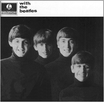 |
| Happy Beatles for happy fans - unused outtake from photo session, Robert Freeman |
In the end the Beatles won and the sleeve went on to become another iconic Beatles image.
For the second time, the tasks to write the notes on the back cover, came to Tony Barrow.
In the United States, the same picture was used for the first Capitol album Meet the Beatles!. However, the US copies were tinted blue.
 |
| Meet The Beatles - USA album |
This article was written by Patrick Roefflaer and you can find it in it's older incarnation here.
Sources:
Books: 'Yesterday' by Robert Freeman, The Beatles Anthology book, 'Many Years From Now' by Miles, 'In My Life' by Pete Shotton, 'The complete EMI Recording Sessions' by Mark Lewisohn and 'The Beatles London' by Mark Lewisohn and Peter Schreuder. And countless websites.
↧
↧
Album covers - A Hard Day's Night
A HARD DAY'S NIGHT
 |
| A Hard Day's Night - Robert Freeman |
 |
| This UK movie poster had even more images |
While there was a blue frame for the British albums, in some countries they used a red frame. For example for the Brazilian and the American album. The US counterpart of A Hard Day's Night had only four large frames instead of sixteen small ones, thus ruining the original idea.
 |
| The US album, ruining the original idea but still a cool design |
 |
| The Brazilian album |
The german film programme was also designed with a red frame. Note Wilfred Brambell as one of the heads.
For the last time, the back cover notes are written by Tony Barrow. There are also four head shots of the Beatles, taken from the movie.
 |
| A Hard Day's Night back cover - Robert Freeman |
Sources:
Books: 'Yesterday' by Robert Freeman, The Beatles Anthology book, 'Many Years From Now' by Miles, 'In My Life' by Pete Shotton, 'The complete EMI Recording Sessions' by Mark Lewisohn and 'The Beatles London' by Mark Lewisohn and Peter Schreuder. And countless websites.
↧
Album covers: Beatles For Sale
BEATLES FOR SALE
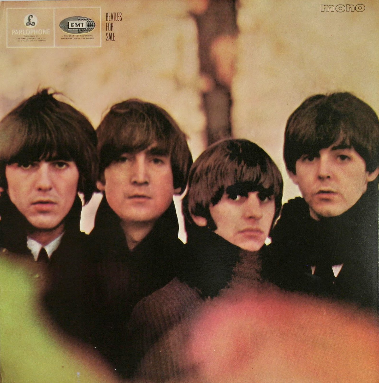 |
| Beatles For Sale - Robert Freeman |
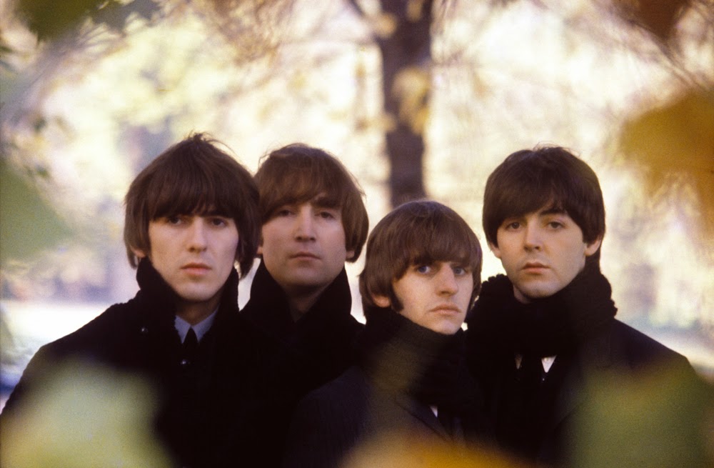 |
| The Beatles For Sale photo - uncropped and slightly different |
On a wintry day at the end of 1964 Robert Freeman took the four to London’s Hyde Park, near the Albert memorial. The guys didn’t have to dress up. They wore their usual black outfits, white shirts and black shawls. Because it was already seven p.m. and getting dark fast, it all had to happen quick. The photographs for the front and the back cover were taken within an hour and a half.
For the front cover, an assistant held up a branch with some leaves, which resulted in some colored spots on the picture.
For the back cover - the favorite Beatles picture of Freeman – he climbed in a tree to take a photograph from there, with a background of autumn leaves.
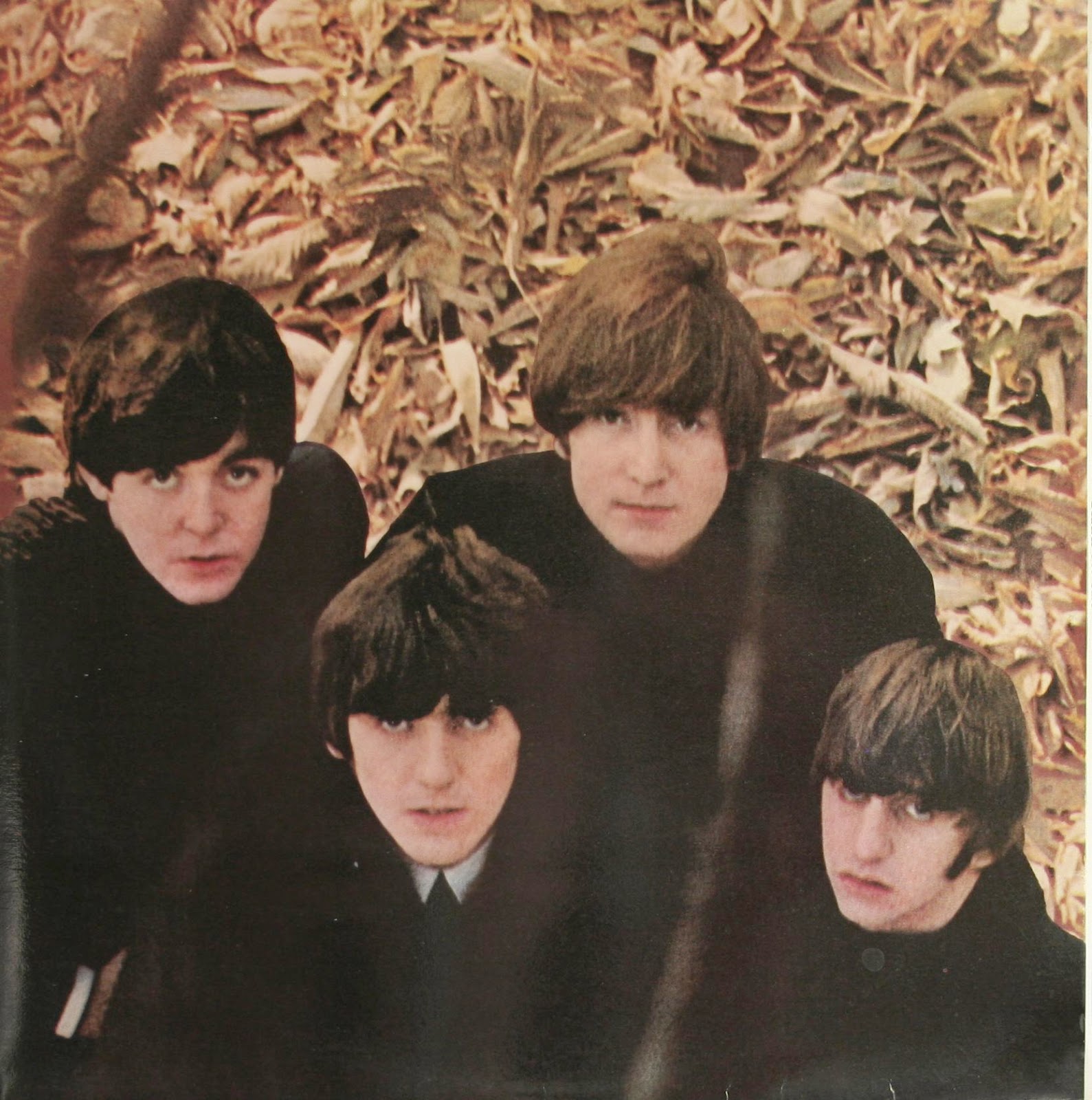 |
| Beatles For Sale back cover - Robert Freeman |
 |
| The uncropped photo |
 |
| Another photo from the session - Robert Freeman |
a scene from their American tour: the Beatles in concert at the Coliseum in Washington DC, on 11 February, 1964. It is a great photo, of which the photographer himself, is rightly proud;
a reflection of their first movie: the Beatles in the Twickenham Film Studios. This picture was taken in the Viewing Theatre, where they watched the ‘rushes’ of A Hard Day’s Night with the director, Richard Lester. They posed before a collage of film stills on the wall by a staircase in the lobby.
 |
| Beatles For Sale - fold out cover |
This article was written by Patrick Roefflaer and you can find it in it's older incarnation here.
Sources:
Books: 'Yesterday' by Robert Freeman, The Beatles Anthology book, 'Many Years From Now' by Miles, 'In My Life' by Pete Shotton, 'The complete EMI Recording Sessions' by Mark Lewisohn and 'The Beatles London' by Mark Lewisohn and Peter Schreuder. And countless websites.
↧
Album covers: Help!
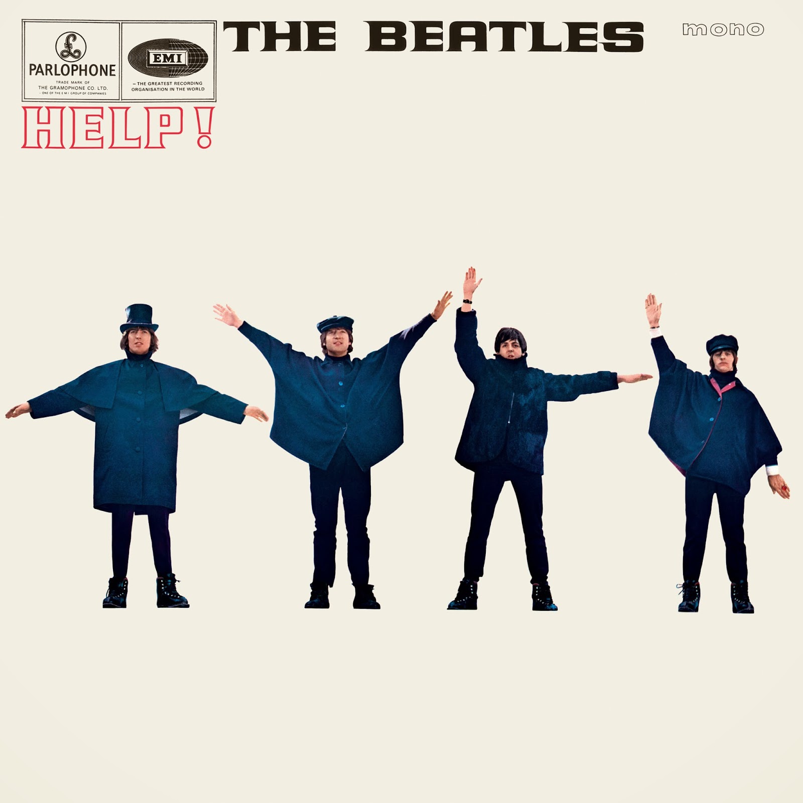
HELP!
 |
| Help! - Robert Freeman |
The photo was taken in the Twickenham Film Studio near London, where the Beatles were finishing the last scenes from their second movie Help!. Freeman had the idea of semaphore spelling out the letters HELP, with every Beatle another letter. He got the inspiration from a scene he witnessed shooting in the Austrian Alps, with the Beatles, all dressed in black, fooling around in the snow. They were waving their arms in the air, while the music played. Freeman took publicity pictures while these scenes were shot in mid march 1965 in Obertauern.
 |
| Publicity pictures like this inspired the Help! album cover |
In the studio a specially constructed platform was erected, with a white painted background. The four young men wore the black hats, coats and capes from the film wardrobe. "But when we came to do the shot the arrangement of the arms with those letters didn't look good," remembers Freeman, "So we decided to improvise and ended up with the best graphic positioning of the arms."
 |
| Ringo poses for the album cover while Victor Spinetti looks at him. |
Within half an hour the pictures were taken.
Afterward, Freeman reversed some of the images, to get a more satisfying composition. For proof of this: look at John, George and Ringo’s jackets: they have the buttons on the wrong side.
 |
| John, George and Ringo reversed back again |
 |
| Different poses for John and Ringo - session outtakes |
 |
| The Beatles actually spell out "NUJV" |
 |
| This is how "HELP" would have looked like with real semaphore. |
 |
| The famous Dutch / Swedish Shell Help! LP cover, 1979. |
During the years, there has been some discussion whether or not the Beatles' hand positions spell anything. It didn’t help that, in the US, the photos on the front cover were rearranged, from George-John-Paul-Ringo to George-Ringo-John-Paul (so that Paul appeared to be pointing to the Capitol logo?). And the image of George is reversed again. By all accounts, the semaphore remains gibberish: the various semaphore messages and their interpretations which have been ascribed to the HELP! cover, over the years are unfounded. The intention behind the arm positions was good "graphic positioning", not good semaphore.
 |
| USA Help! album |
To accommodate lettering advertising the songs, the pictures of the Beatles were shrunk on the cover of the Capitol version of Help!.
There are no sleeve notes , but like on the back cover of A Hard Day’s Night, there are again four head shots taken by Freeman.
 |
| Help! back cover - Robert Freeman |
This article was written by Patrick Roefflaer and you can find it in it's older incarnation here.
Captions by me
Sources:
Books: 'Yesterday' by Robert Freeman, The Beatles Anthology book, 'Many Years From Now' by Miles, 'In My Life' by Pete Shotton, 'The complete EMI Recording Sessions' by Mark Lewisohn and 'The Beatles London' by Mark Lewisohn and Peter Schreuder. And countless websites.
↧
Album covers: Rubber Soul
RUBBER SOUL
 |
| Rubber Soul - Robert Freeman |
 |
| Uncropped photo |
Freeman himself is not really satisfied with the result. He thinks that the budget EMI gave him, was insufficient. In one of his picture books he later printed the same picture in sepia-tones. (See also p. 196 of The Beatles Anthology book). That’s more like the result he was looking after. It mirrored the changing shapes in their lives.
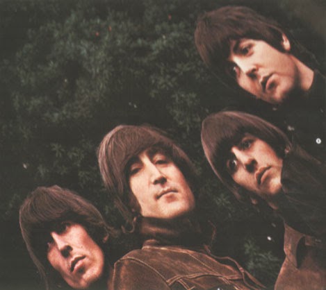 |
| This is how Rubber Soul was presented in one of Robert Freeman's books. |
The four faces on the cover are recognizable enough not to need a groups name on the album. Another first.
 |
| The Italian LP changed the "Rubber Soul" letters. |
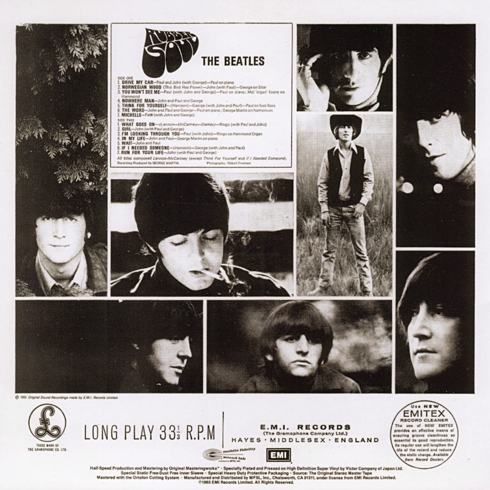 |
| Rubber Soul back cover - Robert Freeman |
Sources:
Books: 'Yesterday' by Robert Freeman, The Beatles Anthology book, 'Many Years From Now' by Miles, 'In My Life' by Pete Shotton, 'The complete EMI Recording Sessions' by Mark Lewisohn and 'The Beatles London' by Mark Lewisohn and Peter Schreuder. And countless websites.
↧
↧
Album covers: Revolver
REVOLVER
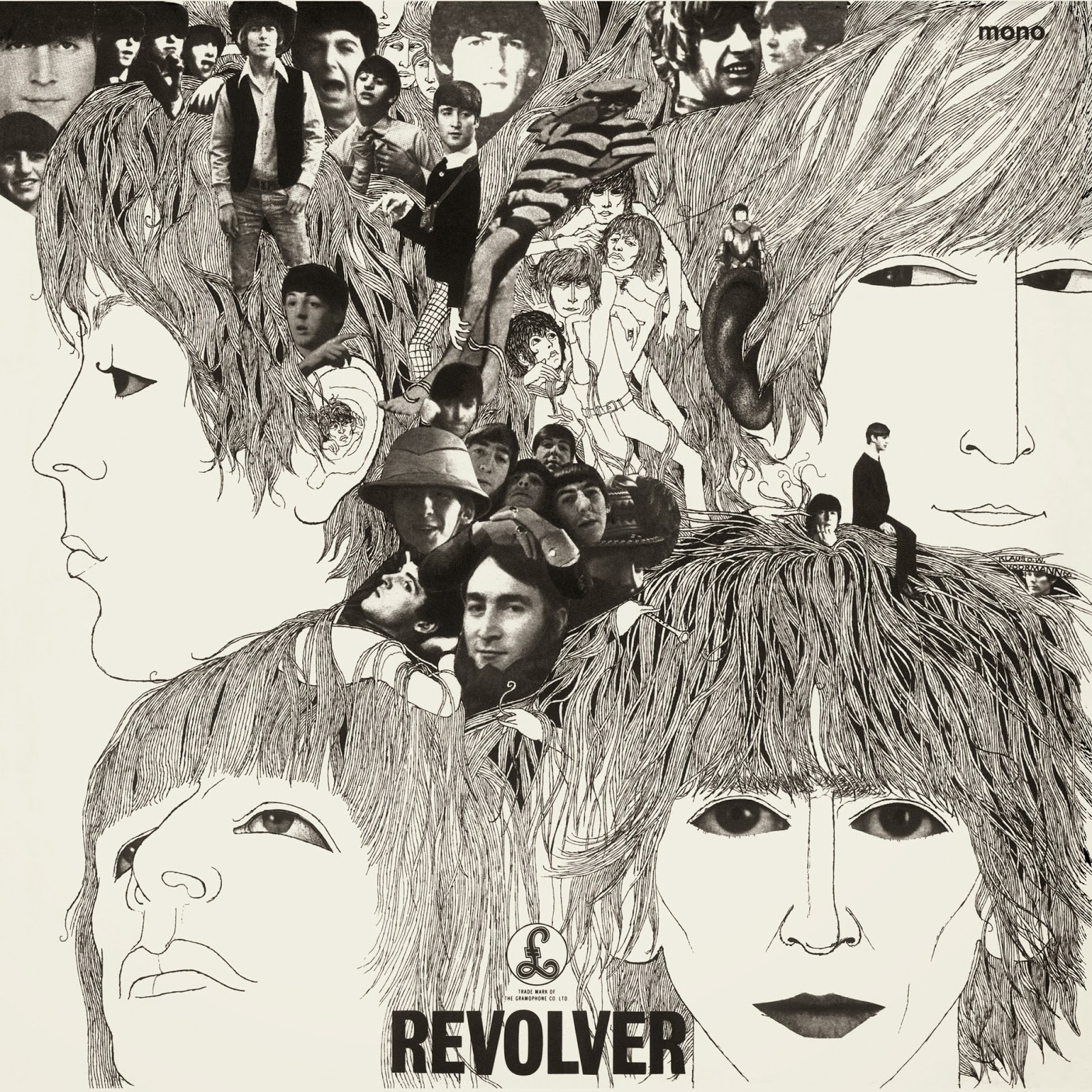 |
| Revolver - Klaus Voormann |
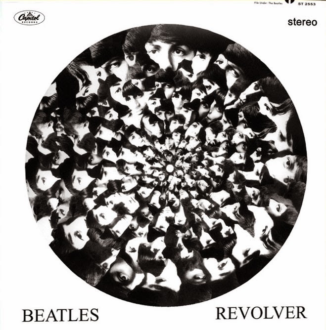 |
| Freeman's design, here presented as a USA edition of the album. |
Because Freeman was going to turn his first movie, in 1966, it was the last time the Beatles used his services. Freeman and the group amiably ended their association. *
You can buy Robert Freeman's book of Beatles photos, "A Private View" through Amazon.
Klaus Voormann, an old friend from Hamburg, who recently had moved to London, was asked to design the cover. After hearing some tracks, he decided that the cover should reflect the same avant-garde feel. "I wanted to push the design further than normal," he told Martin O'Gorman in 2006. "I did a scribble piece on a big A2 layout sheet of paper, with lots of different sketches of the little heads, in felt pen. I didn't do the big representation. I just went to see them with that piece of paper folded up in my pocket and that was enough!"
He than made the line-drawing of the four faces. "I drew the faces from memory," continues Voormann in Mojo. "George's face was very difficult to draw. It was easier with John, Paul and Ringo, but George was always the problem. I could not get his face right, so eventually I took a newspaper and cut those eyes and mouth out."
 |
| Even though Freeman's cover design was rejected, one of his photos became the centrepiece of Voormann's design. |
According to Pete Shotton the cover was finished in Lennon's home, at Kenwood: "John, Paul, and I devoted an evening to sifting through an enormous pile of newspapers and magazines for pictures of the Beatles after which we cut out the faces and glued them all together. Our handiwork was later superimposed onto (the) line drawing by Klaus Voormann."
"The photo of Ringo with the funny striped shirt on," remembers Voormann, "that was cut out of a magazine, from a picture of a girl who had that poster on her wall. That's why the picture is at a funny angle. I had a few strange ones where John was pulling a face, or Paul was laughing, but in general, the photos show their sweet side."
"There was one picture where Paul was sitting on a toilet. I think that photo was taken in Hamburg."
Klaus recalled the presentation of the finished artifact. "I went to the EMI house, up to George Martin's office and I stood the artwork up on a filing cabinet. There was Brian Epstein, George Martin, his secretary and the four lads. I was scared, because nobody said anything. They were just looking at it. I thought, ****, they hate it.
Then Paul looked closer and said, "Hey that's me sitting on a toilet!" George Martin took a look and said, "You can't show that!" Paul said, "No, it's great!" But then he gave it some thought and said, "Well, maybe we should take that one off.." So that broke the ice.
Then they started talking about it. Everybody loved it, George loved it, John loved it, Ringo loved it. I looked at Brian, who was standing in the corner and he was crying… I thought, Oh no… what is he doing? He came up to me and said, "Klaus, this is exactly what we needed. I was worried that this whole thing might not work, but I know now that this the cover. This LP, will work – thank you.""
There's a small drawing of Klaus himself, on the right side, between John and George's heads.
 |
| Early sketch of Revolver - Klaus Voormann |
For the back cover, a black-and white picture by Robert Whitaker shows the four well known faces, covered in sunglasses. It was taken during the shooting of the Paperback Writer/Rain promo films.
 |
| Revolver (UK) back cover - Robert Whitaker |
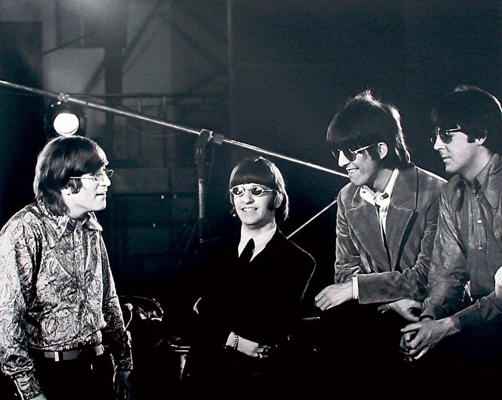 |
| Uncropped original photo - Robert Whitaker |
 |
| We found a different photo on this Revolver (USA) back cover, was it ever like this? - Robert Whitaker |
 |
| It just wouldn't have been the same in colour. |
 |
| Klaus Voormann with the Revolver album |
Captions by me
Sources:
Books: 'Yesterday' by Robert Freeman, The Beatles Anthology book, 'Many Years From Now' by Miles, 'In My Life' by Pete Shotton, 'The complete EMI Recording Sessions' by Mark Lewisohn and 'The Beatles London' by Mark Lewisohn and Peter Schreuder. And countless websites.
* A contributing factor to Robert Freeman's disassociation with the Beatles may have been Lennon's alledged affair with Freeman's German born wife, Sonny.
↧
Album covers: Oldies
A COLLECTION OF BEATLES OLDIES... BUT GOLDIES
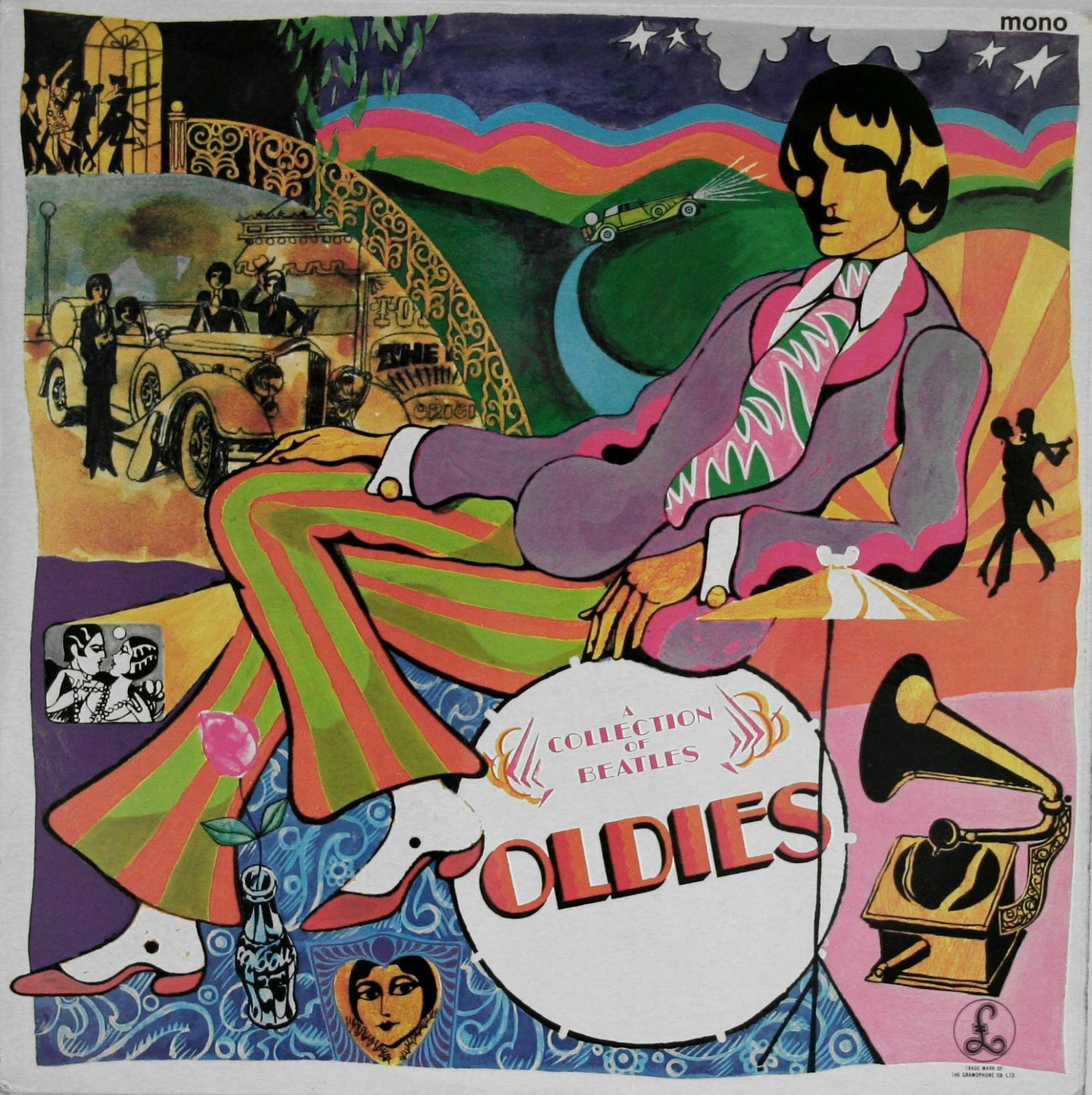 |
| A Collection of Beatles Oldies - David Christian |
The front cover artwork was by David Christian, in very 60's flower power style.
For the rear cover a colour photograph by Robert Whitaker was chosen. It was taken on June 30, while on tour in Japan. Before the first show in the Nippon Budokan Hall they started an oil and watercolors painting on a large paper.
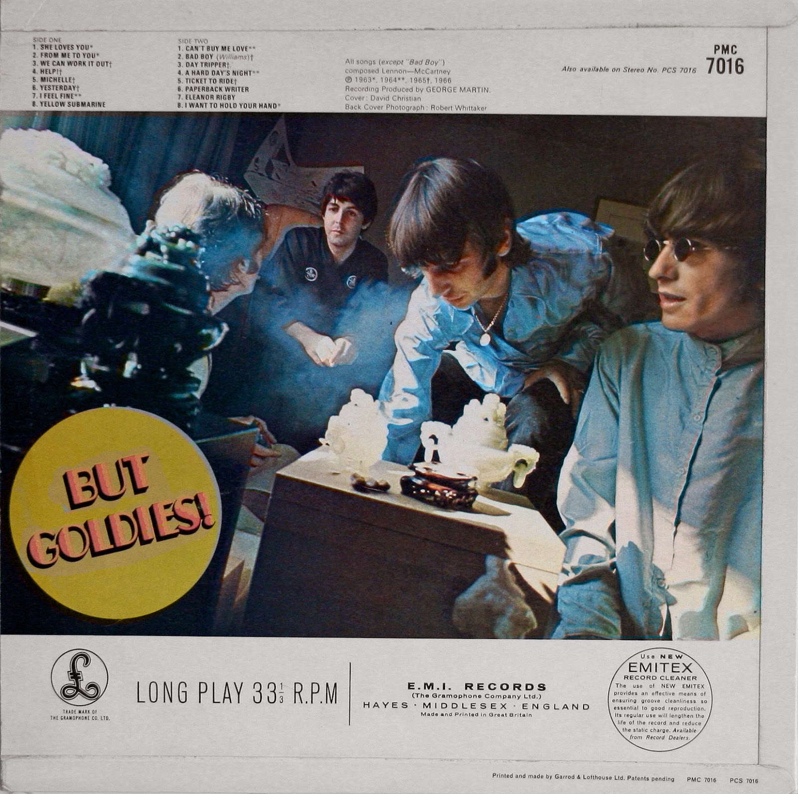 |
| A Collection of Beatles Oldies back cover - Robert Whitaker |
 |
| The Beatles are painting in Japan - Robert Whitaker |
 |
| The finished painting was called "Images of a woman" |
 |
| In Japan, they realised that the photo was in reverse, so they reversed it back. |
This article was written by Patrick Roefflaer and you can find it in it's older incarnation here.
Captions by me
Sources:
Books: 'Yesterday' by Robert Freeman, The Beatles Anthology book, 'Many Years From Now' by Miles, 'In My Life' by Pete Shotton, 'The complete EMI Recording Sessions' by Mark Lewisohn and 'The Beatles London' by Mark Lewisohn and Peter Schreuder. And countless websites.
↧
Album covers: Pepper
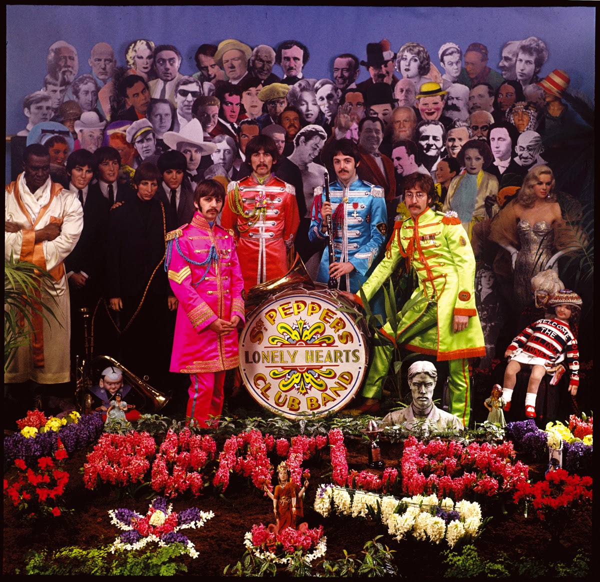
SGT. PEPPERS LONELY HEARTS CLUB BAND
 |
| Sgt Pepper - Peter Blake / Michael Cooper |
Paul McCartney, 1989.
For the cover of their next album, a friend, John Dunbar, suggested a totally abstract picture without text or explanation. But Paul thought that was too radical.
Paul then made a series of pen-and-ink drawings. The starting point was an old photograph of Paul's father, Jim McCartney's jazz band. Initially the drawings showed the Beatles standing before a wall of framed photographs of their heroes. The Beatles all wear long military-band jackets and sport mustaches. They hold brass-band instruments.
 |
| Jim Mac's Jazz Band |
Paul shows the drawings to his friend, the gallery dealer, Robert Fraser. He suggests the use of a fine artist, for example Peter Blake, a man who’d painted the group in 1963 and had a rising reputation in the Pop Art movement.
Fraser and McCartney met with Blake in his West London house to talk over ideas. Paul showed him his basic ideas. "From that came the idea of a life size constructed collage," remembers Blake. "We thought that if we did that we could have anyone in the crowd. That opened up a whole magical area."
Taken by the idea of inventing their own audience, each Beatle compiled a list of "favorite people".
Peter Blake explained: "I asked them to make lists of people they'd most like to have in the audience at this imaginary concert. John's was interesting because it included Jesus and Ghandi and, more cynically, Hitler. But this was just a few months after the US furor about his 'Jesus' statement, so they were all left out. George's list was all gurus. Ringo said, "Whatever the others say is fine by me", because he didn't really want to be bothered. Robert Fraser and I also made lists."
 |
| Different poses were experimented with |
"I still have no idea who chose some of these people, " states George Harrison, "I believe that Peter Blake has placed some of the more confusing types. I only wanted people that I admired. I didn’t put anybody on it that I didn’t like, in contrast to some other people"
Jann Haworth, Blake's American wife and an artist in her own right confirms: "To be perfectly honest, Peter and I chose about 60 percent of what's there because they didn't come up with enough. So we're to blame for some of the inequalities that were there. But having said that, the Beatles chose no women. The only women chosen were by Peter and I."
 |
| There are plenty of outtakes from the Sgt Pepper photo session, strangely enough they are all LP size. |
Michael Cooper, an excellent photographer, was a business partner of Robert Fraser. So he was commissioned to do the shoot. Peter Blake and his wife Jann Haworth worked in his studio for a fortnight constructing the collage.
Jann Haworth claims her part of the idea: "I'm the person who didn't do 50 percent of the Sgt. Pepper cover. I did the other 50 percent. It's sort of invisible, but in a way it's the whole thing: It was to build it like a set. The idea of the front row being three dimensional, leading into a two-dimensional flat frame was very much the territory of my work."
Jann's father, the director Ted Haworth, was in London at the time, working on the film Half a Sixpence. When she visited him on the movie set, he advice her not to make a background piece for the album. He thought the idea was too Hollywood and too expensive for the budget. So Haworth resorted to blue paper for the sky, and black-and-white cut-out photographs for the heads and bodies.
Gene Mahon, a designer who was hired as co-ordinator on the project, selected the more then sixty photographs, collected from libraries and magazines and supervised the enlargements. These life-size cut-outs were then hand-colored and glued to hardboard sheets.
"I hand-tinted all the photographs for color, and nailed them to batons on the back wall," said Haworth. "Then put the front row in 3-D. That's an old movie trick."
Peter and Jann fixed the top row to the back wall and put the next about six inches in front and so on, to get a tiered effect. Some waxworks are rented from Madame Tussaud, while the the old lady and Shirley Temple dolls are art pieces by Jann Haworth. A palm tree and some little favorite objects filled out the decorum. John brought his TV set, while Hunter Davis picked up an ornament from the mantle piece of Paul's house.
Peter Blake recalled: "The boy who delivered the floral display asked if he could contribute by making a guitar out of hyacinths, and the little girl wearing the 'Welcome the Rolling Stones, Good Guys' sweatshirt was a cloth figure of Shirley Temple, the shirt coming from Michael Cooper's young son Adam."
The drum skin was painted by a genuine fairground artist, Joe Ephgrave. He did actually two versions. The chosen design is now part of Beatles iconography and is probably the second most famous drum skin of all time.
 |
| John took the one that was used on the cover, the reject ended up with Paul |
The Beatles had military styled costumes made for them especially by Burman’s Theatrical Agency. "They showed us pictures of the possibilities," remembers Paul, "Did we want Edwardian costumes or costumes from the Krim? We chose eccentric things from the different types and combined. … We chose psychedelic colours, a bit like the day-glow socks from the fifties."
Sir Joseph Lockwood personally was afraid the picture of Mahatma Gandhi would upset the government of India. So he had to go at the last minute. So did Hitler.
 |
| Wrong drum head |
 |
| Sgt Pepper front cover photo - uncropped |
Sir Joe also realized that because many of the people that are depicted were still alive, they might be sued for not seeking their permission. So he demanded a written permission from every one to get copyright clearance. Brian Epstein, who was very wary of all the complications in the first place, had his former assistant Wendy Hanson, write to everyone. "I spent many hours and pounds on calls to the States," remembers Wendy, "Fred Astaire was very sweet; Shirley Temple wanted to hear the record first; I got on famously with Marlon Brando, but Mae West wanted to know what she would be doing in a Lonely Hearts Club."
 |
| The mono reel to reel tape of Sgt Pepper from Great Britain presented the cover image less cropped than the album did. |
The Beatles arrived during the evening of March 30, 1967. "We had a drink," remembers Blake, "they got dressed and we did the session. It took about three hours in all, including the shots for the center fold and back cover."
Originally a Dutch group called the Fool had made a design for the center fold.
Miles: "Simon and Marijke painted a dream landscape of stylised mountain peaks and wonderful birds, like an LSD-influenced Chinese willow-pattern design. The sky was rainbow-ed with two oval panels for text, one of which was filled with stars and comets. A further empty panel had a flower border with a peacock draping its tail over the side. Tiny figures of the Beatles peeped out from among the flora. The style was Euro-psychedelic, owing much to Mucha, Beardsley, art nouveau and nineteenth-century children’s book illustrations. Unfortunately they got the dimensions wrong, but even with a border added, the work looked somehow second-rate. The Beatles, however, loved it."
 |
| Sgt Pepper unused foldout cover - The Fool |
But Fraser saw it differently. He felt it would be judged by posterity as simply another piece of sixties acid art. Robert suggested a series of portrait shots instead. For this picture the Beatles all looked in the camera and tried to express a feeling of love to their fans. "And that’s what that is," declares Paul "if you look at it you’ll see the big effort from the eyes".
 |
| Sgt Pepper foldout cover - Peter Blake / Michael Cooper |
For the first time ever, lyrics of all the songs are printed on the back. In the book "Juan & John", written by Javier Adolfo Iglesias it is revealed that this was a request from an English teacher in Spain. The man, Juan Carrión used popular music to make it more interesting for his students.
When he learned that John Lennon was in Almeria to film How I Won The War, he travelled over there to ask if The Beatles could print the lyrics of their songs on their album sleeves. He explained to John that it sometimes was hard to transcribe them from the records.
Northern Songs, the Beatles music-publishing company, immediately objected, because it would cut the sales of their sheet music.
 |
| Sgt Pepper back cover - Peter Blake/Michael Cooper |
 |
| Sgt Pepper inner sleeve - The Fool |
 |
| Sgt Pepper insert cut-out cardboard sheet - Peter Blage / Michael Cooper |
Peter Blake again: "I'm not sure how much it all cost. One reads exaggerated figures… I got about 200 pounds. People say to me, "You must have made a lot of money on it" but I didn't because Robert signed away the copyright. But it has never mattered too much because it was such a wonderful thing to have done."
Everyone loved the cover, but Brian Epstein had his doubts. He was already stressed out because of an increasing distance growing between him and the Beatles and became even more anxious about the numerous drug references in Sgt. Pepper's Lonely Hearts Club Band. He was worried what the pictures on the sleeve would do to further tarnish the band's clean-cut image he had worked so hard to establish. At one point, he had written himself a note about the possibility of the album in a brown paper bag.
He shouldn’t have worried, because, during the tenth annual Grammy Awards, on 9 March 1968 Sgt. Pepper’s is voted Best Album Cover, Graphic Arts of 1967. Besides being chosen as Album of the Year, Best Contemporary Album, Best Engineered Recording, but that’s another matter.
This article was written by Patrick Roefflaer and you can find it in it's older incarnation here.
Captions by me
Sources:
Books: 'Yesterday' by Robert Freeman, The Beatles Anthology book, 'Many Years From Now' by Miles, 'In My Life' by Pete Shotton, 'The complete EMI Recording Sessions' by Mark Lewisohn and 'The Beatles London' by Mark Lewisohn and Peter Schreuder. And countless websites.
Want more Pepper?
WogBlog-articles about Sgt Pepper's Lonely Hearts Club Band from the archives:- Who is who on the Pepper cover?
- Where are the Sgt Pepper suits now?
- Sgt Pepper as a concept album
- Sgt Pepper's caravan reappears!
- My Sgt Pepper exhibition
- Advertising Sgt Pepper
- The Sgt Pepper TV
↧
Album covers: Magical Mystery Tour
MAGICAL MYSTERY TOUR
 |
| Magical Mystery Tour EP - John Kelly |
The first meeting about Magical Mystery Tour took place at McCartney’s home, at the start of September 1967, with the beginning of the recordings a week later.
 |
| From the cover photo session. |
In England the songs were presented as a double EP (extended play) package. It contained two 3 track E.P.'s and was advertised as being complete with "A 32 page full colour book packed with exclusive pictures, a strip cartoon of the original story, plus the words to the songs in the show !"
 |
| Page from the booklet |
However the booklet contained only 28 pages. The photographs are taken by John Kelly. Some of the pictures represent scenes that were cut from the actual movie.
First pressings had a gate fold picture sleeve, with a full booklet, and a blue lyric sheet. For later repressings, the colour of the lyrics sheet was changed to yellow. The singles were housed in white inner sleeves, which fitted in pockets on the inside of the covers.
 |
| Magical Mystery Tour - back cover |
In the USA, the EP format no longer was used, so Capitol decided to upgrade the five songs with some recent non-album singles to a full LP. It was released eleven days earlier on 27th November 1967.
 |
| Magical Mystery Tour - album |
This article was written by Patrick Roefflaer and you can find it in it's older incarnation here.
Captions by me
Sources:
Books: 'Yesterday' by Robert Freeman, The Beatles Anthology book, 'Many Years From Now' by Miles, 'In My Life' by Pete Shotton, 'The complete EMI Recording Sessions' by Mark Lewisohn and 'The Beatles London' by Mark Lewisohn and Peter Schreuder. And countless websites.
↧
↧
Album covers: Yellow Submarine
YELLOW SUBMARINE
 |
| Yellow Submarine - Heinz Edelmann |
The art design is by Heinz Edelmann.
Derek Taylor was asked to write the liner notes for the back cover, but "he decided that not only he had nothing new to say…" so he simply attached a review of The Beatles by a journalist from the London Observer, Tony Palmer.
For the American public, Capitol asked Dan Davis to write some new liner notes, that situated Yellow Submarine on a timetable starting "between the years 700 and 750 (anno Domini)". Therefore the printing style and layout of the back cover are completely different from the U.K. issue.
But also the front differed: the first UK cover had two red lines, one below the drawing of the Beatles and Yellow Submarine and another one below the liner note. On the U.K. and France pressings, the words "NOTHING IS REAL" are printed at the center of the front cover. These are omitted an the U.S. and Japanese pressings.
 |
| Yellow Submarine back cover |
Captions by me
Sources:
Books: 'Yesterday' by Robert Freeman, The Beatles Anthology book, 'Many Years From Now' by Miles, 'In My Life' by Pete Shotton, 'The complete EMI Recording Sessions' by Mark Lewisohn and 'The Beatles London' by Mark Lewisohn and Peter Schreuder. And countless websites.
↧
Album covers: Get Back (Unreleased)
GET BACK (UNRELEASED)
 |
| Get Back album (unreleased) - Angus McBean. There are no known official back cover designs. |
In the mindset of the 'back to the roots feeling' of the January 1969 sessions, it was decided that the cover for Get Back should be similar to that of their first album, Please Please Me. The photograph would produce a remarkable side-by-side comparison of how much the four men had changed in those six intervening years.
Angus McBean was commissioned to make an exact replica of that famous first cover. He recalled the occasion: "(In 1963) I asked John Lennon how long they would stay as a group, and he said, "Oh, about six years, I suppose – who ever heard of a bald Beatle?". Well, it was just six years later that I was asked to repeat the shot with the Beatles as they now looked – very hairy indeed. When I got there I couldn’t retake the shot; a new porch had been built and I couldn’t get into the same position.”
A few photos were taken. These are easily identified because John and George are wearing different jackets.
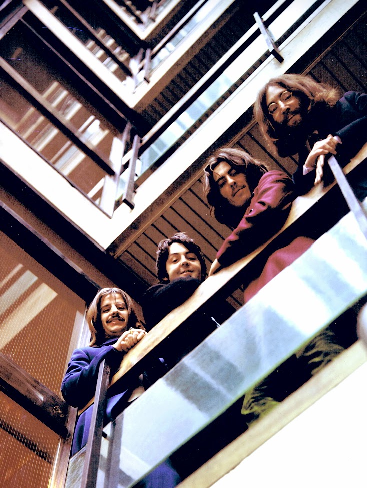 |
| Early May 1969: First attempt. Photo: Angus McBean. |
This second attemp was on May 13, 1969. This time John and George are wearing their 1966 tour suits, with pin stripes.
 |
| 13 May 1969: Second attempt. Photo: Angus McBean. |
“Ringo Starr was so late that the staff of EMI was streaming down the stairs”, adds McBean. “I got the camera fixed up and John, fascinated by photography, came and lay down beside me to look at my view-finder. I can still hear the screams of the EMI girls as the realized who they were stepping over to get out the door!"
 |
| Get Back bootleg. |
In July 1969 the album was rescheduled for September 1969, to appear together with the planned TV special and theatrical film about the recording of the album.
In September the album was rescheduled again for December, because The Beatles had recorded Abbey Road in the meanwhile and wanted to release that album instead of Get Back, in which no member of the Beatles was really interested anymore.
As time went on, the film about Get Back was completed and it became obvious, that there were some recordings in the film, that weren't featured on the album. So the already completed album was shelved again and on January 5, 1970, Glyn Johns compiled a second version for the Get Back album. The cover art wasn't changed, only the title was altered, due to the fact that 'Let It Be' was planned to be the next single.
 |
| When the title was changed to "Let It Be", the cover design was still the same for a while. Bootleg recreation. |
The McBean shoot however wasn't wasted, as this was eventually used on the 1973 compilation "Red" and "Blue" albums.
 |
| The Beatles / 1967-1970, aka "the Blue Album". |
This article was written by Patrick Roefflaer. The previous incarnation of this article can be found here.
Captions by me
Sources:
Books: 'Yesterday' by Robert Freeman, The Beatles Anthology book, 'Many Years From Now' by Miles, 'In My Life' by Pete Shotton, 'The complete EMI Recording Sessions' by Mark Lewisohn and 'The Beatles London' by Mark Lewisohn and Peter Schreuder. And countless websites.
↧
What Macca did next
 |
| The Wings trio perform "Mull of Kintyre on Top of the Pops, 1977. |
Link: What Macca did next:The decade with Wings
The story of how one man took on the seemingly impossible task of following his work in the most popular group of all time, and emerged as the leader of another multi-million-selling global sensation. What Paul McCartney did next after the Beatles was to retreat to Scotland, reshape his life and career, become a solo star and then form one of the biggest bands of the decade, Wings.
Johnnie Walker presents some sounds of the '70s with a difference, richly illustrated with world exclusive interview material.
When the Beatles split, Paul became a family man and, ably abetted by his wife Linda, went into a period of experimentation with the superb 'McCartney' and 'Ram' albums. But it wasn't long before he was missing the vibe of a band, and that's where Wings first took flight and became the real-life band on the run.
This programme is based around a brand new, never-before-heard McCartney interview, and other rare audio material, all full of vivid recollections and poignant stories. It comes as two more albums in Paul's 1970s catalogue are given the deluxe reissue treatment, 1975's 'Venus and Mars' and the follow-up released only ten months later, 'At The Speed Of Sound.'
The narrative extends through the entire ten-year period, as a celebration of a group that, for many pop fans growing up in the 1970s, were more relevant than the Beatles themselves. It describes how they came to life with 'Wild Life' in 1971 and - since their "Wingspan" covered the whole of the 1970s, until their last album 'Back To The Egg' in 1979 - sets their story within the context of the decade itself, with a new interview with Wings' Denny Laine and unheard insight from designer Aubrey Powell of Hipgnosis and engineer Alan O'Duffy.
↧
Album covers: Abbey Road
THE BEATLES' UK ALBUM COVERS
by Patrick RoefflaerFor the writing of this article I have used information found in the following books: 'Yesterday' by Robert Freeman, The Beatles Anthology book, 'Many Years From Now' by Miles, 'In My Life' by Pete Shotton, 'The complete EMI Recording Sessions' by Mark Lewisohn and 'The Beatles London' by Mark Lewisohn and Peter Schreuder.
Furthermore I found interesting information on countless websites. The previous incarnation of this article is here.
ABBEY ROAD
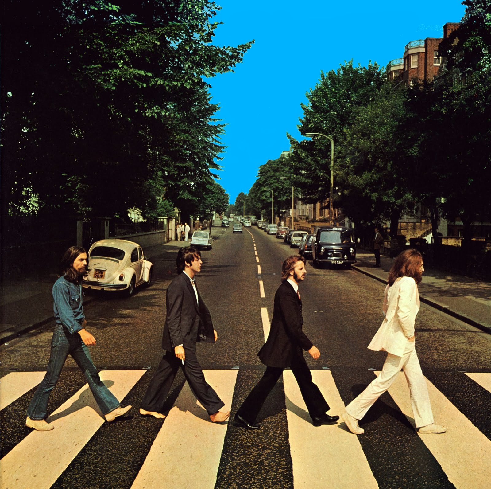 |
| Abbey Road - Iain Macmillan |
When asked how far they wanted to go, the reply came: "Why don't we just do it in the street?"
Paul immediately made a rough drawing and freelance photographer Iain Macmillan, a friend of John and Yoko, was asked to make the picture.
 |
| Paul's drawing |
Thanks to the research of Mark Lewisohn we know now that Macmillan used a Hasselblad camera, with a 50 mm wide-angle lens, aperture f22, at 1/500 sec.
Linda McCartney took some extra pictures of the Beatles, while they were waiting for the session.
This time the album came without a title on the front cover, and no lyric sheet ... being quite simple, it just had one photograph on the front, and one on the rear. For the back cover Iain Macmillan took a photograph of one of the many old-style tiled street signs.
 |
| Abbey Road back cover photo - Iain Macmillan |
A few months later every detail of this and the previous Beatles sleeves were studied the world over to search for clues for the dead of Paul McCartney. "I started to get letters and cards from people outlining how obvious it was that Paul was dead," recalled George Martin. "They said that they understood all our clues on the covers over the past few years years and, you know, I started believing it myself."
Peter Blake too was almost fooled: "We went to visit Paul. We talked about the rumors and he said, "You know I’m not Paul McCartney. You met Paul when you were working on Sgt. Pepper and he didn’t have a scar on his mouth. Look, I’ve got a scar. I’m a stand in." And just for a moment, I wasn’t sure. Then he told me that he’d fallen off his bicycle…"
In March 1970 Abbey Road won a Grammy for "Best Engineered Non-Classical Recording".
In the wake of the album title, the EMI Studios were later re-named as "Abbey Road Studios".
The celebrated cover was copied by Paul for his Paul Is Live album, in 1993.
 |
| Paul is live - Iain Macmillan |
 |
| Paul on the Abbey Road crossing |
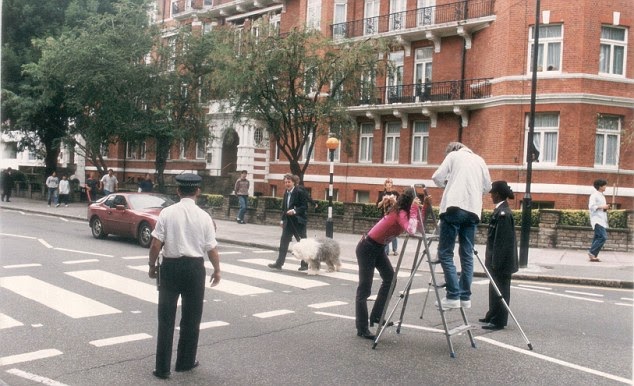 |
| A stepladder was also in use for Paul's solo photo shoot |
 |
| The promo album sampler shows the modern day Abbey Road backdrop |
↧
↧
Album covers: Let It Be
THE BEATLES' UK ALBUM COVERS
by Patrick RoefflaerFor the writing of this article I have used information found in the following books: 'Yesterday' by Robert Freeman, The Beatles Anthology book, 'Many Years From Now' by Miles, 'In My Life' by Pete Shotton, 'The complete EMI Recording Sessions' by Mark Lewisohn and 'The Beatles London' by Mark Lewisohn and Peter Schreuder.
Furthermore I found interesting information on countless websites. The previous incarnation of this article may be found here.
LET IT BE
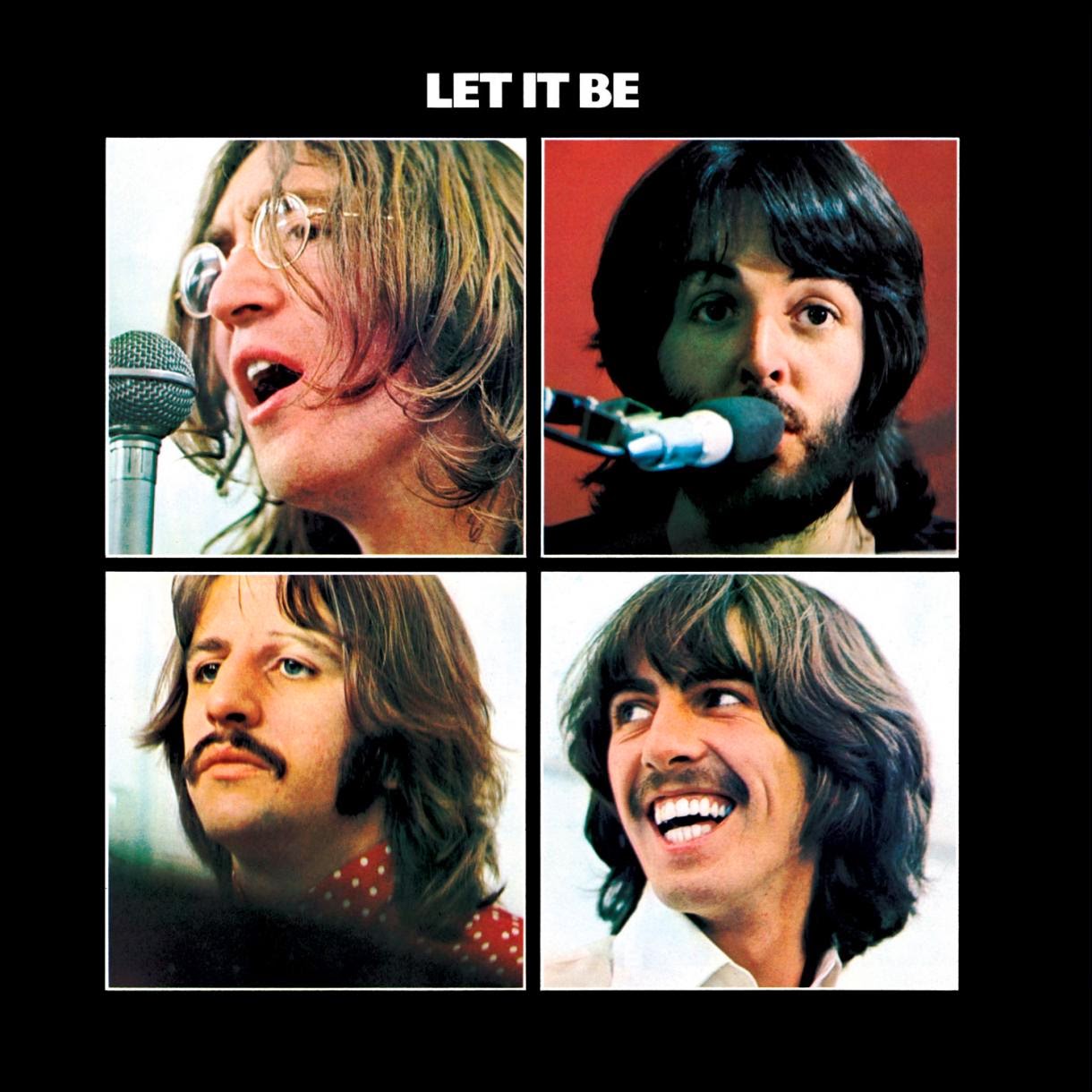 |
| Let It Be - Ethan Russel/John Kosh |
When the album with the material from the sessions, recorded in January 1969, finally was released in May 1970 the back cover noted: "This is a new phase BEATLES album ... essential to the content of the film, LET IT BE was that they performed live for many of the tracks; in comes the warmth and the freshness of a live performance; as reproduced for disc by PHIL SPECTOR."
With the work of Phil Spector everything was changed. The album got it's new title, a new cover was designed and there was nothing that reminded of the original Get Back anymore.
It was felt that the picture taken by Angus McBean no longer was up to date. So some other photo was needed, but by now the Beatles had, in fact, split up and no one was interested in anything that was "Beatles" anymore. A photo session was out of the question.
John Kosh, who was responsible for designing the package, assembled four independent pictures against a black background. The photos were taken by Ethan A. Russell, during the film recordings in January 1969. On the back cover there were four more black-and-white pictures, the above text, plus a red Apple logo, marking the end of the Beatles.
 |
| Let It Be back cover - Ethan Russel/John Kosh |
 |
| Let It Be boxed set - Ethan Russel/John Kosh |
The large paperback, called "The Beatles Get Back" contained stills and dialog from the film printed on high quality glossy paper. The photographs were by Ethan Russell, and the text by Rolling Stone writers Jonathan Cott and David Dalton.
 |
| The Get Back book - Ethan Russel/John Kosh/Jonathan Scott/David Dalton |
 |
| A poster advertising other Apple records was included with some, but not all of the Let It Be boxed sets. |
 |
| The UK catalogue number of the box was PXS 1, but the number only appeared on a sticker which was affixed to some of the review copies of the album box. |
For the second British pressings, half a year later, the box set and book were dropped. In it's place came a standard album release. Even the red apple was gone, and replaced with the usual green one.
In the U.S., the album was issued with a gatefold cover with more pictures… and a red label. No box,
no book.
 |
| Let It Be USA fold out cover - Ethan Russel |
↧
The Beatles and "the Cliff Richard law"
 |
| A single from Kutmusic |
From 1 November 2013, The Copyright and Duration of Rights in Performances Regulations 2013 came into force, implementing the provisions of Directive 2011/77/EU which extended the term of copyright in sound recordings from 50 to 70 years. The change came after years of political wrangling and means that performers are entitled to receive income for an additional 20 years. Additional measures were also included to improve performers' revenue.
Extension from 50 to 70 years
One song can contain a number of different rights, for example copyright in both the music score and in the lyrics, both of which lasted for 70 years after the death of the author. In contrast, copyright in the actual sound recording, however, and the duration of a performers' rights in the recording only lasted for 50 years. The new Directive extended both of these terms from 50 years to 70 years, therefore narrowing the gap.
While some critics argued that many musicians would see little benefit, a study by the European Commission ("EC") found that extension of this term would give average performers additional income ranging from €150 to €2,000 per year, mostly from airplay royalties. Although these sums are fairly insignificant to many of the big names in the music industry, they are considerable for many other musicians, particularly session musicians. The EC also pointed out that many performers started their career in their 20s and that with life expectancy increasing, a performer who lives into his 80s and beyond would not be able to continue to benefit from the recording at what the EC pointed out to be a particularly vulnerable time of life.
It should be noted, however, that the extension will only apply to sound recordings that are created after 1. November, or that are still in copyright protection on 31 October 2013. It would not therefore bring a sound recording back into copyright where this protection has already expired after the 50 years.
Use it or lose it
"Use it or lose it": If a record company fails to market a sound recording during the extended period, assigned rights in the recording may revert back to the performer.
 |
| Work in Progress - Outtakes 1963 from Rock Melon |
It is that last sentence which made The Beatles release the title "Bootleg Recordings 1963" at the end of last year. They tried to release everything that was still unreleased recordings from 1963 in order to retain their copyright to these recordings. However, they failed. A number of 1963 recordings remained unreleased, and therefore entered the public domain on January 1st, 2014. This was then taken advantage of by several minor record companies, who went on to release these songs, live performances and takes of songs in 2014.
A release called The Beatles: Work in progress from the Rock Melon label continues to be available in Europe, and is showing healthy sales.
2015
Now that the final day of 2014 is upon us, unless the Beatles/Apple/Universal Music are putting these last few hours to good use, all unreleased Beatles recordings from 1964 will become fair game for companies like Kutmusic and Rock Melon. Unless there's something I've missed.
We are talking studio session outtakes and unreleased radio material, but the main source will be live recordings of Beatles concerts. There are lots of these available on bootlegs, and this material will now be available for both big and small record companies to profit from. Hitherto unknown live recordings may also appear from fans' private collections during the year.
As "The Beatles Live Project" is on Apple's official agenda for 2015, they will have an opportunity to counteract by releasing lots of this kind of material officially, with nice packaging, liner notes, photos etc that the independent labels probably can't afford. Still, once the official packages are out, it looks to me like anyone else can just duplicate the stuff and market it at lower prices.
It's going to be an interesting year for Beatles fans.
↧
The Apple logo
THE APPLE LOGO
by Patrick Roefflaer
Perhaps this is the right place to add something about the Apple logo. Apple Records of course was The Beatles own record company, launched in the summer of 1968. It was first used on the single ‘Hey Jude’/’Revolution’.
In 1993 Paul McCartney explained to the Belgian journalist Johan Ral the origins of the Apple idea. “….I had this friend called Robert Fraser, who was a gallery owner in London. We used to hang out a lot. And I told him I really loved Magritte. We were discovering Magritte in the sixties, just through magazines and things. And we just loved his sense of humour. And when we heard that he was a very ordinary bloke who used to paint from nine to one o’clock, and with his bowler hat, it became even more intriguing.
Robert used to look around for pictures for me, because he knew I liked him. It was so cheap then, it’s terrible to think how cheap they were. But anyway, we just loved him … One day he brought this painting to my house.”
 |
| Le jeu de mourre - René Magritte |
What happened next is explained by Paul in more detail in the book Groovy Bob: The Life and Times of Robert Fraser, by Harriet Vyner (1999)
“I was out in the garden with some friends. I think I was filming Mary Hopkin with a film crew, just getting her to sing live in the garden, with bees and flies buzzing around, high summer. We were in the long grass, very beautiful, very country-like. We were out in the garden and Robert didn’t want to interrupt, so when we went back in the big door from the garden to the living room, there on the table he’d just propped up this little Magritte. It was of a green apple. That became the basis of the Apple logo. Across the painting Magritte had written in that beautiful handwriting of his ‘Au Revoir’. And Robert had split. I thought that was the coollest thing anyone’s ever done with me. When I saw it, I just thought: ‘Robert’. Nobody else could have done that. Of course we’d settle the bill later. He wouldn’t hit me with a bill.”
 |
| Martha and Paul, the painting's on the wall. |
In 1993 Paul concluded: “And this big green apple, which I still have now, became the inspiration for the logo. And then we decided to cut it in half for the B-side!”
The name of the painting is actually ‘Le jeu de mourre’ (The Game of Mora). In René Magritte - Catalogue Raisonné (edited by David Sylvester. Menil Foundation/Fonds Mercator, 1993), it is listed as number 1051 and situated late in the artist’s life, in 1966. As Paul still has the original painting only a black and white photograph is available to the public.
That title was given by a friend of Magritte’s, the Belgian poet Louis Scutenaire. It probably is a pun on ‘Les jeunes amours’ (The Young Lovers), another work by Magritte depicting three apples. The Game of Mora is an existing game. In the catalogue mentioned above, the Larousse dictionary definition of Mora, or Mourre is quoted as "a game in which one of the players rapidly displays a hand with some fingers raised, the others folded inwards, while his opponent calls out a number, which, for him to win, has to correspond to the total of the raised fingers".
 |
| A colour photo of the painting was published here on Wogblog in March 2014. |
 |
| The b/w photo of the painting colourised to match the photo |
In June 2008 The Beatles Collection website gave a great summary of how this all came about:
“[It was Gene Mahon who] proposed having different labels on each side of the record. One side would feature a full apple that would serve as a pure symbol on its own without any text. All label copy would be printed on the other side’s label, which would be the image of a sliced apple. The white-colored inside surface of the sliced apple provided a good background for printing information.
The idea of having no print on the full apple side was abandoned when EMI advised Apple that the contents of the record should appear on both sides of the disc for copyright and publishing reasons. Although Mahon’s concept was rejected for legal (and perhaps marketing) reasons, his idea of using different images for each side of the record remained. Mahon hired Paul Castell to shoot pictures of green, red and yellow apples, both full and sliced. The proofs were reviewed by the Beatles and Neil Aspinall, with the group selecting a big green Granny Smith apple to serve as the company’s logo. A sliced green apple was picked for B side. Alan Aldridge provided the green script perimeter print for labels [on UK, EU and Australian releases – this does not appear on US labels] and, in all likelihood, the script designation on the custom record sleeve.”
The red Granny Smith apple was used in 1970 for the US issue of the Let It Be album. As that album, for contractual reasons, was being manufactured and distributed in North America by United Artists Records, the red apple was used to mark the difference.
↧


